This post is a response to a Scott Thomas photographic assignment. Scott has a great blog, Views Infinitum, where he shares his photographic journey as well as a lot of great content for budding photographers like myself. It doesn’t hurt that he is a Disney fan as well, which is how I found him in the first place, even though he is just down I-90 from me.
Every couple of months Scott presents an assignment which helps us explore a particular aspect of photography. The first assignment I participated in concerned the ‘Rule of Thirds’. From that first post I was hooked, although to be honest I have missed more than I probably participated in. The current assignment is about color in composition (related post).
I decided when I read the post that I was going to approach it from two different angles. First I was going to make an effort to capture some fresh images with the intent of using them for the assignment, which means I would have to think about what I was doing more than I normally do. The second angle was to review my older images and see how I had used color in the composition. I waited until after I gathered the new images before searching through my hard drive.
Fresh Captures:
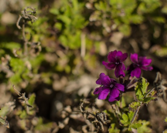
This first image uses the purple of the flowers against the green background to help draw the eye immediately to the subject. It also doesn’t hurt that I have placed the flowers on an intersecting third of the image. Every little bit helps…
This second image once again uses a stand out color object, the orange, rusty barrel, against the muted colors of the grass and gravel. I probably cheated on this one too by creating an angular focus zone oriented with the barrel. The selective focus was just a little experiment on my part but it turned out kinda cool so I left it. 🙂
This third image is all about the color of the sky. There was a great range of color created by the setting sun. I had the visible orange glow on the horizon as the sun slipped below and then the red reflection in the clouds with a nice blue background in the middle. I used the tree in silhouette to give some scale and I like the detail in the limbs of a bare tree.
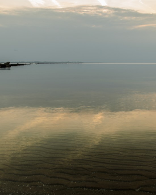
The fourth image is one I am a little less sure of fits within the assignment. It is from my excursion to the beach on Saturday but after the sun decided to hide from me. The majority of the scene has a blue tone due to the late hour and the amount of cloud cover. The bottom third of the image has the color from the sand and the cloud reflections. It is definitely the first part of the image you notice and then you are drawn into the thin horizon and the rest of the picture by the cloud reflections in the water.
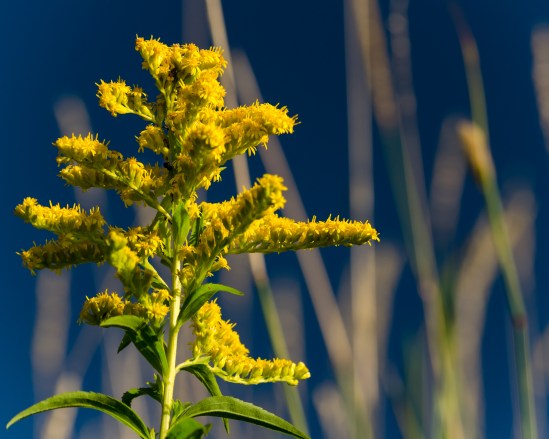
My second approach to Scott’s assignment was to review my older images and see how I have used color in my compositions. I have to say that I do have a tendency to use color to isolate or highlight my subject. I know it isn’t always a conscious effort on my part and I’m not sure where I picked it up but apparently something has been sinking in from all those books I have been reading.
Older Images:
and I even do it when on vacation…
Well, this has probably been the longest post I have every done. It was great going out with the intent of capturing images for this assignment. It had me looking at everything differently. I spent more time selecting my view and composition. I know I should be doing that more as I’m out exploring but sometimes I just click away instinctively. I’m sure I will find the right balance and in the long run I’ll improve my images. Thanks Scott!


Nice use of the color wheel! Thanks for sharing!
Thanks! It was a great assignment and has me thinking more when I’m out with the camera.
Is ther a particular kind of camera you prefer? http://www.segmation.wordpress.com
I absolutely love the single yellow leaf against the dark branches! All of the photos are lovely!
Thanks! I have a tendency to use the yellow on blue often, but it does work so well… 🙂
What a great choice of pictures your presented for Scott’s assignment !
The Harper’s Mills is a beauty, so is the lone and persistent yellow leaf hanging from a branch. The rusty barrel is great too. Congrats !
Thanks! Like I mentioned in the post, some I did intentionally and the others I’ll attribute to instinct. 😉
I just kept thinking…”Nice Nice Nice! Aren’t these assignments fun! They are especially good ways to learn new stuff, and to help us figure out what we’ve done in the past. I liked them all, and found the beach one really interesting, whether or not it fits the assignment!
Thanks Dawn! I had higher hopes when I drove to the beach but what I came away with I am very happy with. And yes, Scott’s assignments are great. They keep me thinking, exploring and learning…
Hi Mike! Really love the photo with the setting sun and the tree silhouette. Just wonderful. You have a gorgeous selection of photos here.
Thanks! That particular picture was a lucky accident. I was late leaving work one day, complaining to the person I was walking out the door with when I stopped as soon as I stepped outside. I put my stuff in the car, grabbed the camera and clicked away. I haven’t complained since… 🙂
Pingback: Assignment 22: Recap | Views Infinitum