Oil Can Project – OCP07
As I work on this Oil Can Project I find myself conflicted in the direction it should go. I have been loving the Black & White version of all the cans. I think processing the images as such creates a very dramatic look and brings out the details in each one. There have been a couple of oil cans that I thought looked very cool in the color version of their image. Today’s image drives this internal debate to new heights…
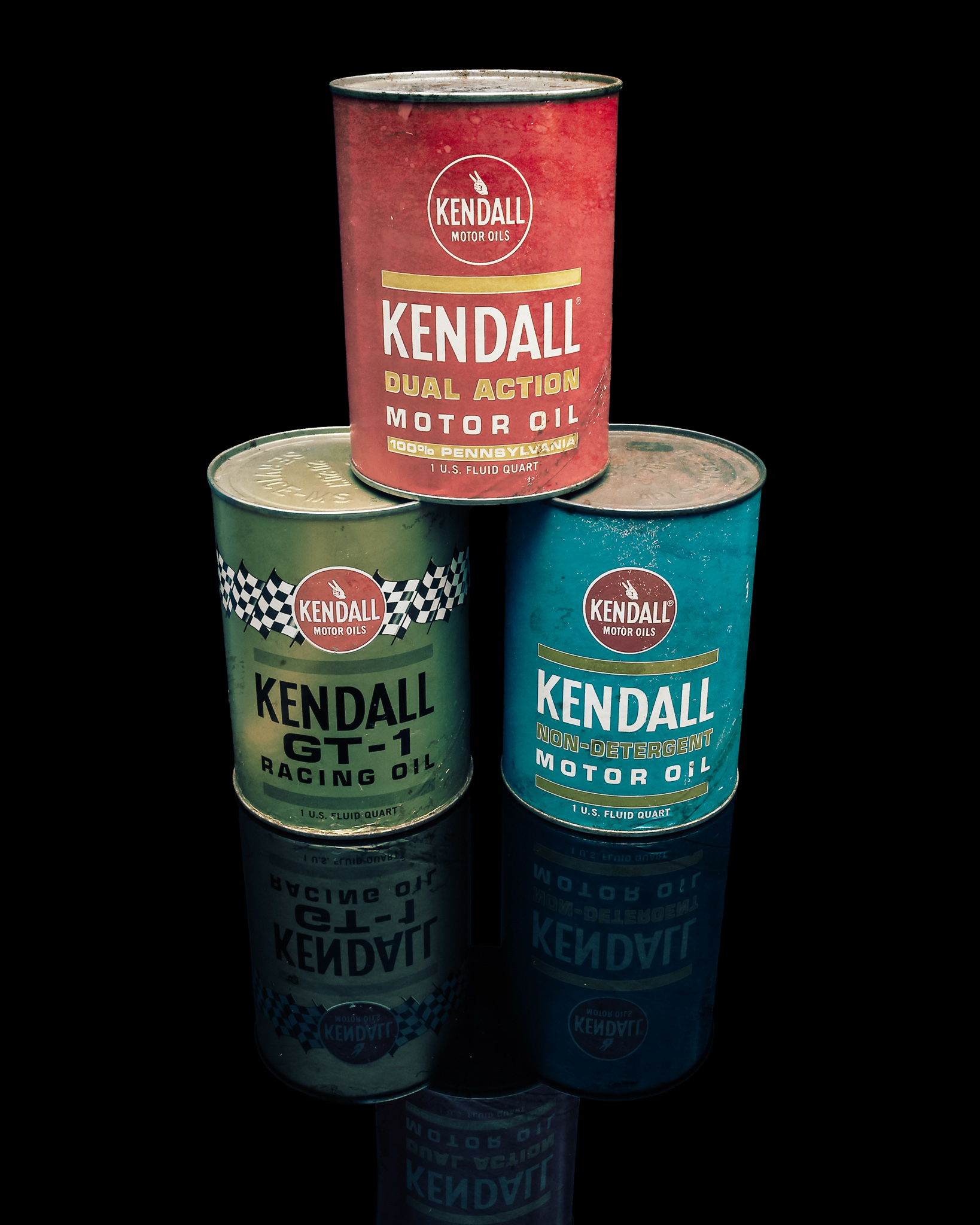
Quite a few weeks ago I found a set of Kendall motor oil cans at one of the shops I have been frequenting. At the time I already had my hands full of other items but not wanting to “lose” a potential addition to my project I bought the red can. I have attempted numerous times to photograph the single can but I was never happy with the results.
I received the other two cans as part of my Christmas loot. Having a nice trio of cans solidified my resolve to “find” the image I wanted for my project. The result is the first image below. Now I have another issue, the color version is a stronger image in my opinion. This is bringing all sorts of thoughts to my internal debate on the direction of this project.
Then I couldn’t help myself. I took the color version a little farther by adding a slight vintage look to the image. I reduced the saturation, added a slight blue tone and finished it off with a grunge texture overlay. For me, this puts the color image back inline with the monochrome oil cans.
I’m still not positive the direction this project will take, but that is half of the fun…

Olympus OM-D E-M1, M. Zuiko 12-40mm f/2.8, 1/30s, 14mm, f/11, ISO 200

Olympus OM-D E-M1, M. Zuiko 12-40mm f/2.8, 1/30s, 14mm, f/11, ISO 200
Olympus OM-D E-M1, M. Zuiko 12-40mm f/2.8, 1/30s, 14mm, f/11, ISO 200

I like the blue tinged vintage shot. I like the black and white too…the full color is fine, but not as artsy. To me anyway.